


Bond Design Company fashions a family-friendly ski cabin with bold colors, retro details and a whimsical spirit in Little Cottonwood Canyon
Photos by Lindsay Salazar
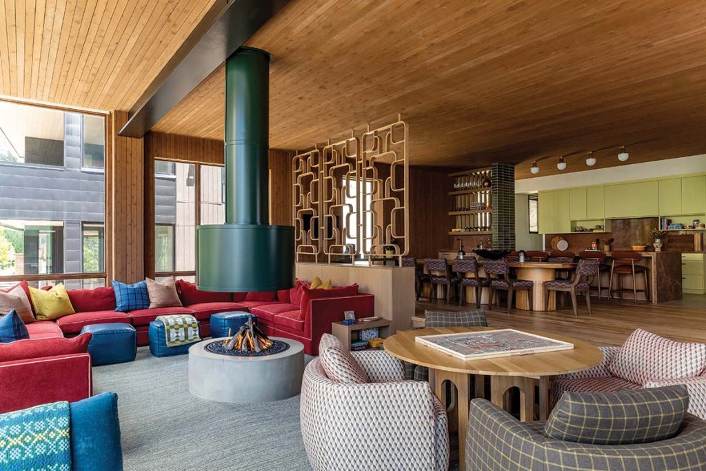
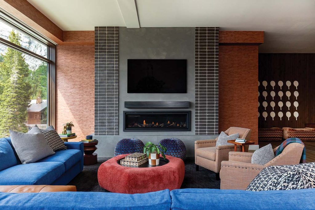
In the sunken great room, a floating fireplace, a large, custom-designed red sectional and a table for games and puzzles flanked by oversized lounge chairs set the stage for relaxing times spent with family and friends.
When you think of a ski cabin, you likely envision a rustic, snowy escape outfitted with antler decor, plaid throws and heavy log timbers. But when Laura Kramer of Bond Design Company got the call from a local couple who wanted to create a family-friendly ski getaway nestled between the slopes of Alta and Snowbird, the design directive was anything but expected.
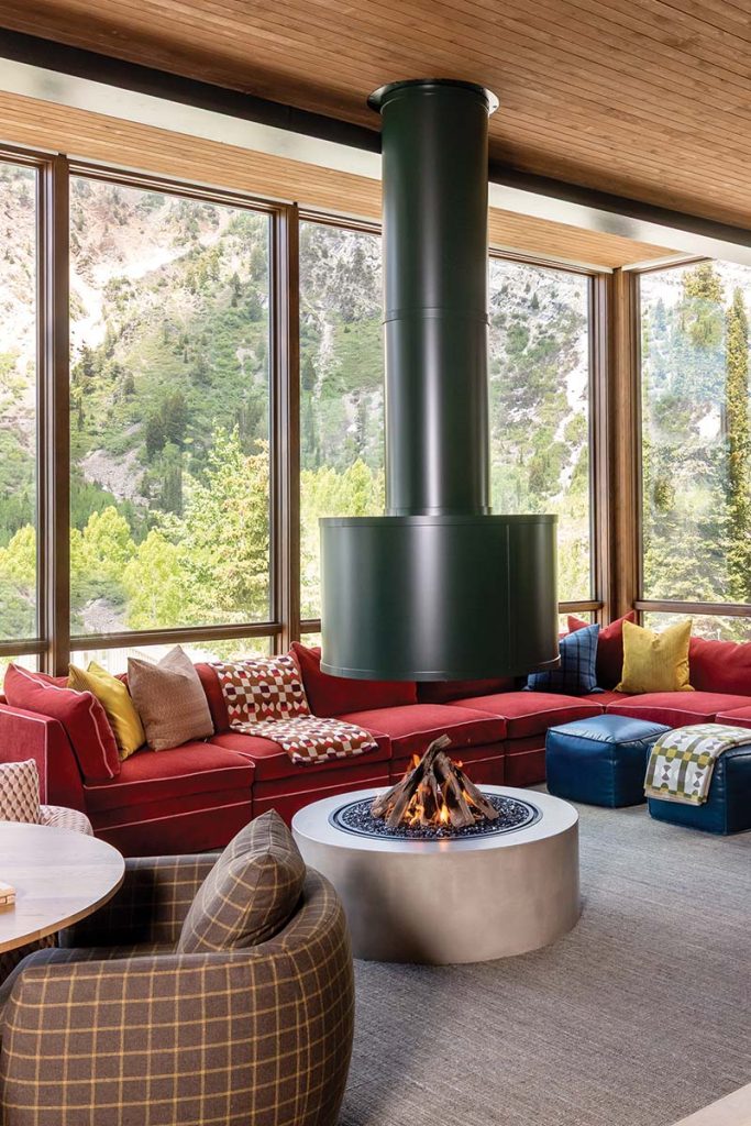
Welded onsite, the sculptural fireplace that anchors the sunken great room boasts an Essex Green finish and required reimagining the layout and reinforcing the structure.
“The clients had two requests: bold personality throughout and a floating fireplace front and center,” explains Kramer. “After generations of skiing these mountains, they wanted a place that could host friends, family and kids, with a playful, retro spirit.”
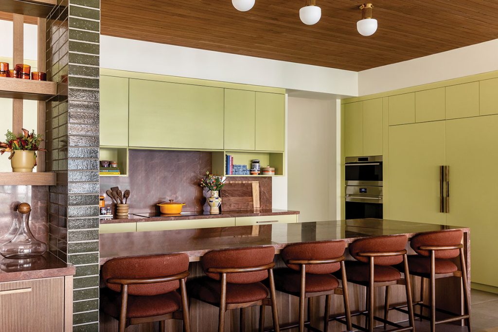
The sleek kitchen cabinets were designed by Peppertree Kitchen & Bath, and painted in the hue Hearts of Palm by Sherwin Williams. “Hopefully it inspires a few brave souls to go bold too,” says Kramer of the bright shade. “The world needs more colorful kitchens!”
Designed by architect Michael Upwall, the four-story, ski-in/ski-out getaway was built as a lively landing pad for the local family, who has deep roots in Little Cottonwood Canyon. Clocking in at just over 8,000 square feet, with eight bedrooms and four and a half bathrooms, the home offered plenty of space for Kramer to get creative. “What began as a subtle nod to midcentury design evolved into a confident embrace of color and whimsy,” she says.
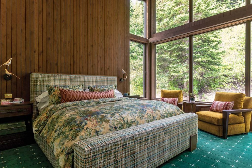
“The idea that neutral fabrics belong on the big pieces and the playful ones are reserved for accents is completely thrown out the window in this space,” says Kramer. Custom bed by Vanguard. Les Hasards Heureux fabric by Misia Paris.
Kramer delivered on the request for a floating fireplace in the sunken great room, the cabin’s main gathering area. But it proved to be a true labor love: “We had to rework the home’s layout, adjust ducting and bring in extra structural support to make it happen,” she recalls. “The piece was welded on-site and finished in Essex Green paint by Benjamin Moore—it actually took months to find a painter skilled enough to tackle it.”
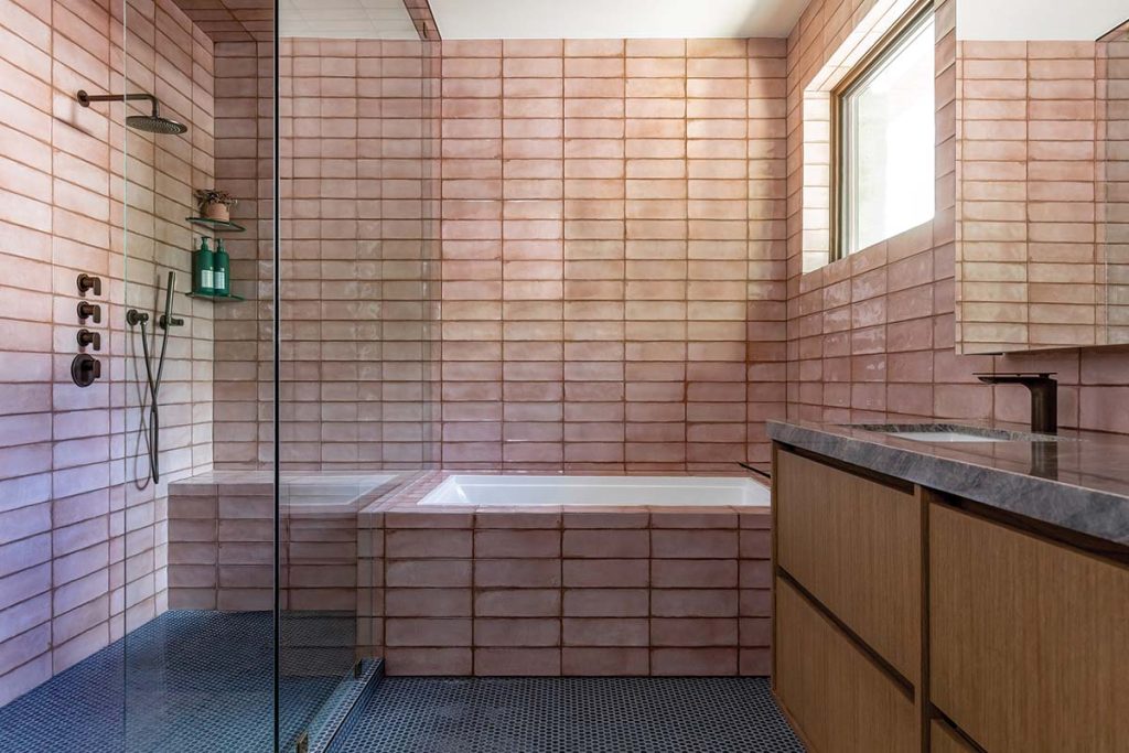
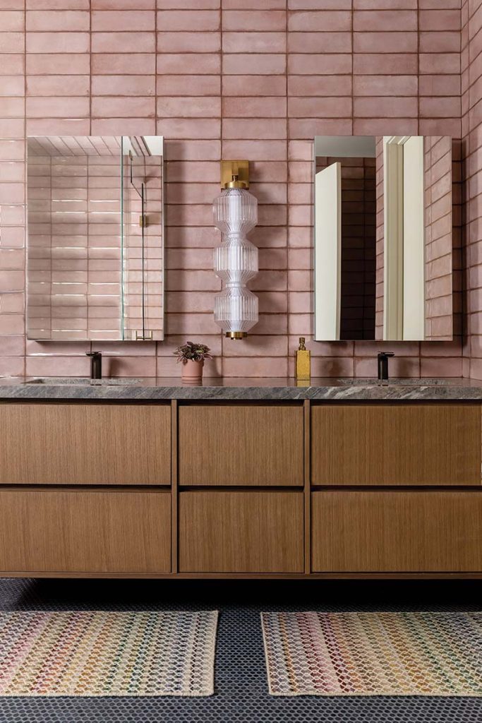
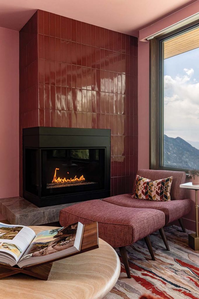
In the retro-with-a-modern-twist pink primary bathroom, the Los Lunas rose pink polished ceramic tile is from Tilebar.
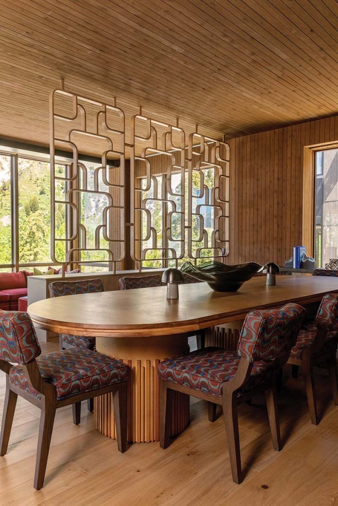
Another labor of love: A midcentury-inspired partition wall that provides separation between the great room and dining/kitchen areas without sacrificing the stunning mountain views. “The client had originally found a similar vintage piece they wanted to incorporate into the home, and we did everything we could to make it work—but the dimensions just weren’t right, and nothing else quite matched its charm. So, we decided to design one ourselves,” says Kramer. Franklin Woodworking brought the vision to life, handcrafting the custom partition wall on-site.
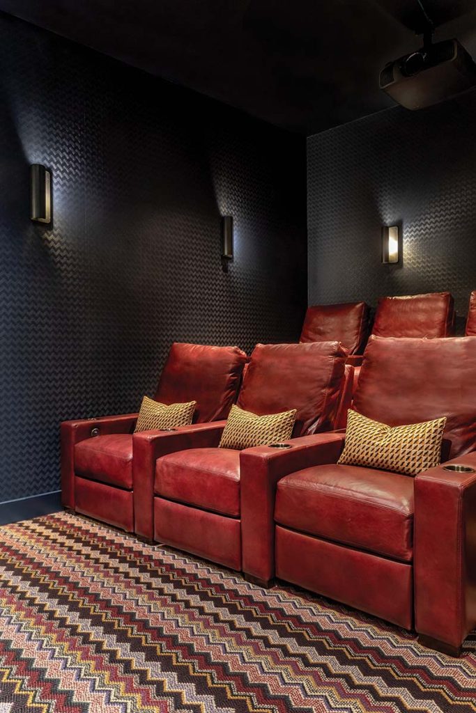
Throughout the cabin, saturated color takes center stage, including in the family and game room, where a cobalt-blue and cognac leather sectional meets a bold red ottoman for a cozy yet vibrant mix.
In the kitchen, surprising and colorful design details continue with chartreuse-hued cabinets and Brown Chocolate quartzite countertops and backsplash. “The chartreuse cabinet color was definitely a choice,” says Kramer. “The clients wanted something unexpected in the kitchen, and chartreuse certainly checks that box.” They picked the color first, and then worked backwards to select materials and finishes that would support the bright shade and make it feel curated rather than overpowering. “As a designer, it’s always a fun challenge to choose something that isn’t typical or ‘on trend’ and then find a way to make it feel elevated and intentional,” says Kramer.
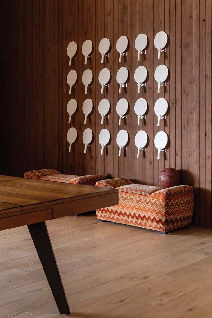
In the game room, a custom ping-pong paddle display with acrylic mounts features unfinished wooden paddles for family and friends to decorate and make their own. “It’s like a living art installation that will evolve with every visit,” says Kramer.
She embraced a similar design ethos when it came to the primary bedroom, commissioning a custom bed completely upholstered in a multi-colored plaid fabric. “Typically in bedrooms, the ‘fun’ fabrics only show up on the pillows,” explains Kramer. “But we loved this one too much to stop there. So we upholstered the entire bed in it.”
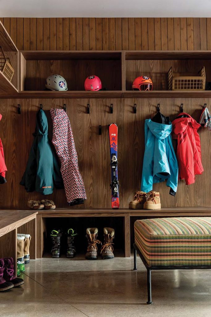
The cabin was designed as a true ski-in/ski-out retreat, so a fully functional gear room was a must. “We outfitted the space with cubbies, hooks, lockers, benches, ottomans and even boot and glove warmers,” says Kramer. For a dose of personality in the practical space, they upholstered large ottomans in Pierre Frey’s Cala Foret fabric.
This color-drenched den or “woman cave” was designed exclusively for the wife and mother of the home. “This space was meant to be her personal retreat—a place to unwind with a good book or a TV show, uninterrupted,” says Kramer. “She wanted something unapologetically feminine, yet still modern.” The paint color is Amaryllis by Benjamin Moore.
In the primary bathroom, they went for a retro look with pink tile but kept things feeling current and fresh with rosy Spanish tile on the walls, tub and shower paired with blue penny tile on the floor, Elysium quartzite on the counters and made-to-order, brushed-brass plumbing fixtures. “The horizontal straight stack of the pink tile is one of the ways we modernized the tile selection,” notes Kramer. “It’s proof that your tile layout alone can completely shift the direction of a design.”
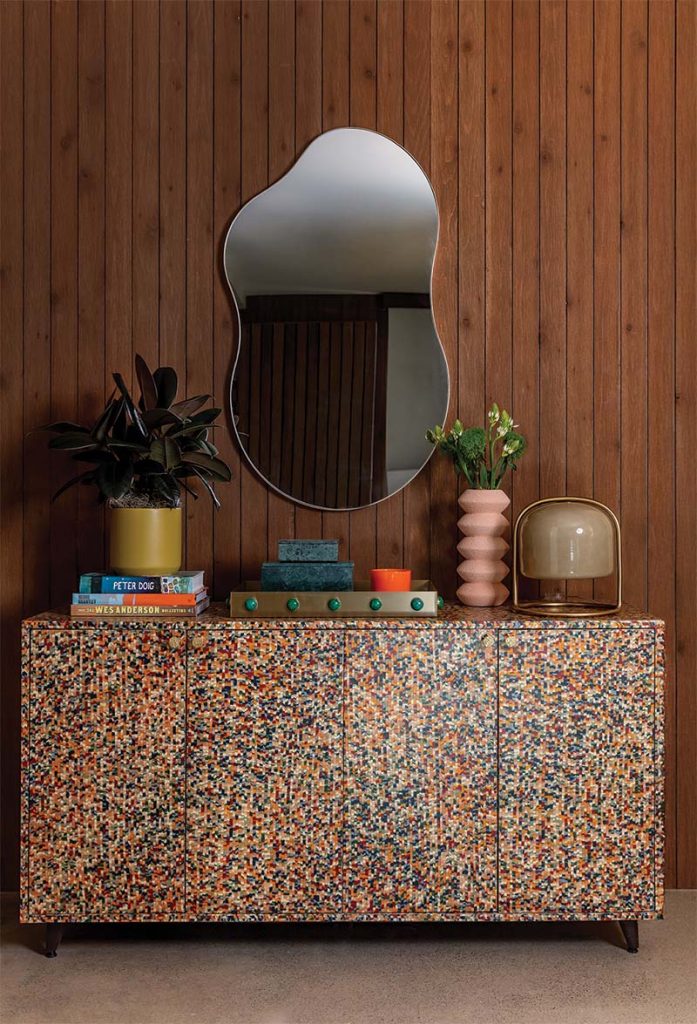
This small landing zone sits between the ski room, garage and main-level entry. “Though we didn’t have a ton of square footage to work with, we still wanted to make an impact—a functional drop zone that could handle the family’s daily flow while hinting at the personality of the rest of the home,” says Kramer. This colorful Martina Buffet is by Made Goods.
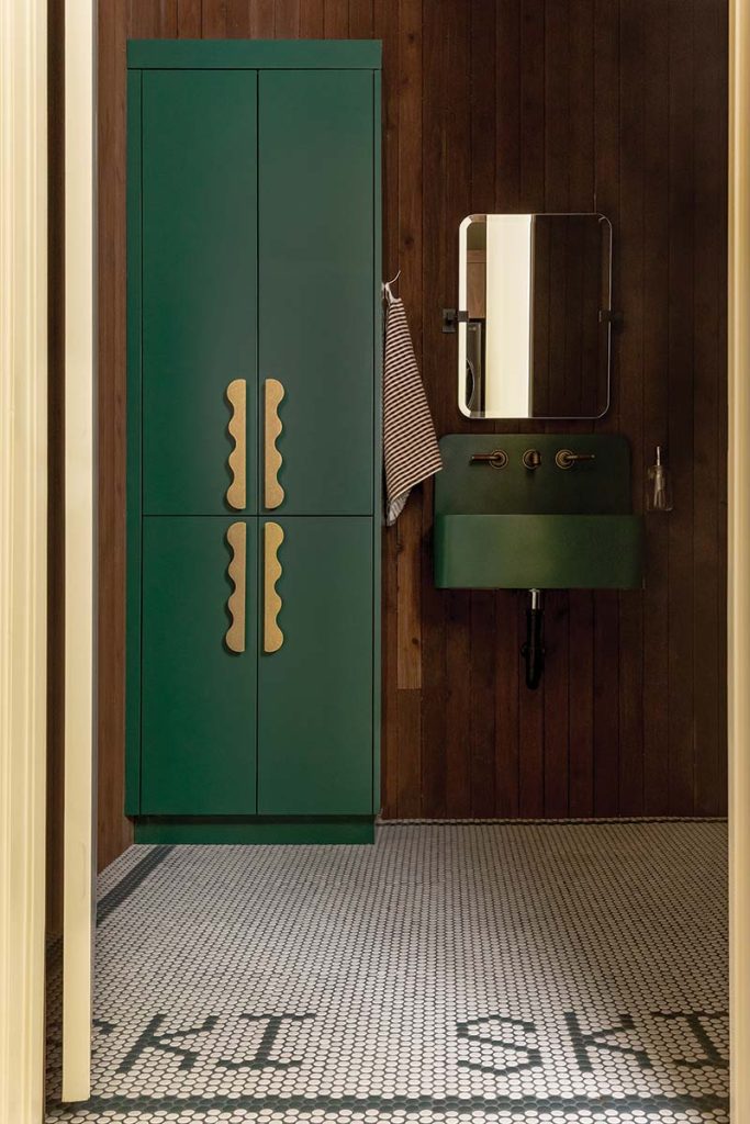
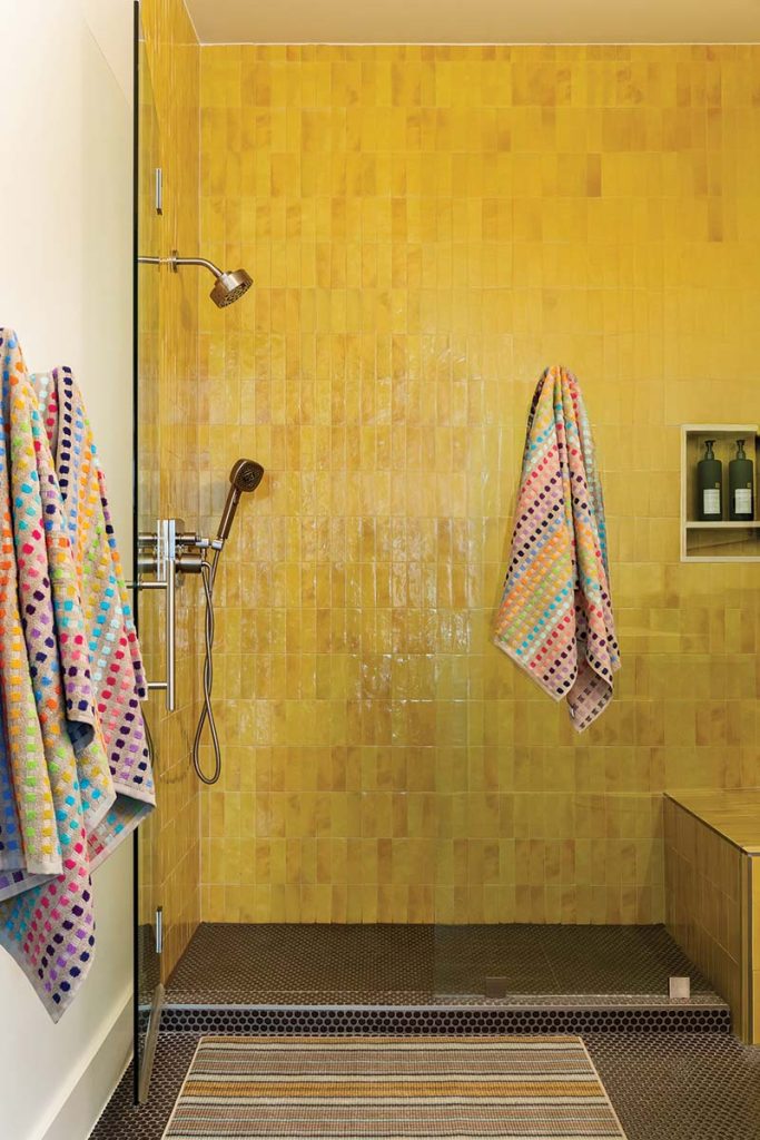
Elsewhere in the cabin, vibrant and playful tile makes an appearance in additional restrooms. In a cheerful loo near the hot tub, a steam shower features yellow square zellige tiles coupled with mauve penny tile underfoot. And in a powder bath next to the kitted-out ski gear room, penny tile is used to spell the word “ski” repeatedly on the floor.
“At its core, this home is a celebration of color and play,” says Kramer. “It’s modern without taking itself too seriously, nostalgic without feeling stuck in time and filled with little moments meant to surprise and delight.”
“What began as a subtle nod to midcentury design evolved into a confident embrace of color and whimsy.“
Laura Kramer
Read more of our entertainment coverage and get the latest on the design lifestyles encompassing Utah. And while you’re here, subscribe and get four issues of Utah Style and Design, your curated guide to the best decor in Utah.
